When using titles in your movies, you should follow some basic guidelines to make them more effective. After all, funny or informative titles don’t do much good if your audience can’t read them. Follow these general rules when creating titles for your movies:
- Less is more. Try to keep your titles as brief and simple as possible.
- White on black looks best. When you read words on paper, black letters on white paper are easier to read. This rule does not carry over to video, however. In video images, light characters over a dark background are usually easier to read. An exception would be if you already have a relatively light background. But what if I want to put that same title near the top of the screen instead? The dark-colored title won’t work as well at the top of the screen because trees in the background will make it harder to read. As an alternative, I can create a small, dark background shape behind lighter colored text. (I’ll show you how to control title colors and styles in the next couple of sections.) Video displays such as TVs and computer monitors generate images using light. (You can think of a TV screen as a big light bulb.) Because TV displays emit light, full-screen titles almost never have black text on a white screen. Most people find staring at a mostly white TV screen about as unpleasant as staring at a lit light bulb: If you watch viewers look at a white TV screen, you may even see them squint. Squinting is bad, so stick to the convention of light words over a dark background whenever possible.
- Avoid very thin lines. In an interlaced display —such as a TV — every other horizontal resolution line of the video image is drawn in a separate pass or field. If the video image includes very thin lines — especially lines that are only one pixel thick — interlacing could cause the lines to flicker noticeably, giving your viewers a migraine headache in short order. To avoid this, choose fonts that have thicker lines. For smaller characters, avoid serif fonts such as Times New Roman. Serifs (the extra strokes at the ends of characters in some fonts, such as the one you’re reading right now) often have very thin lines that flicker on an interlaced video display.
- Think big. Remember that the resolution on your computer screen is a lot finer than what you get on a typical TV screen. Also, TV viewers typically watch video from longer distances than do computer users — say, across the room while plopped on the sofa, compared to sitting just a few inches away in an office chair. This means the words that look pleasant and readable on your computer monitor may be tiny and unintelligible if your movie is output to tape for TV viewing. Never be afraid to increase the size of your titles.
- Think safety. Most TVs suffer from a malady called overscan, which is what happens when some of the video image is cut off at the edges of the screen. You can think of TVs as being kind of like most computer printers. Most TVs can’t display the far edges of the video image, just as most printers can’t print all the way to the very edges of the paper. When you’re working on a word processing document, your page has margins to account for the shortcomings of printers as well as to make the page more readable. The same applies to video images, which have title safe margins. To ensure that your titles show up on-screen and are not cut off at the edges, make sure your titles remain within this margin (also sometimes called the title safe boundary). Apple iMovie doesn’t show these margins on-screen; instead, it automatically keeps your titles inside the margins. If you know your movie will be viewed only on computer screens, place a check mark next to the QT Margins option in the Titles window. This places the margins closer to the edge of the screen.
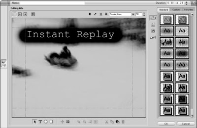
Pinnacle Studio’s Title Editor works like most video-editing programs:
- The margins are displayed on-screen and you have to remember to keep your titles inside them. The margins appear in the Title Editor window as red dotted lines.
- Play, play, play. I cannot stress enough the importance of previewing your titles, especially overlays. Play your timeline after adding titles to see how they look. Make sure the title is readable, positioned well onscreen, and visible long enough to be read. If possible, preview the titles on an external video monitor.
You can use transitions between full-screen titles and other video clips. Dissolves often look nice when used to transition from a full-screen title to the video.

 When using titles in your movies, you should follow some basic guidelines to make them more effective. After all, funny or informative titles don’t do much good if your audience can’t read them. Follow these general rules when creating titles for your movies:


