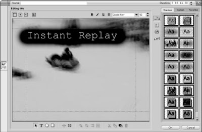
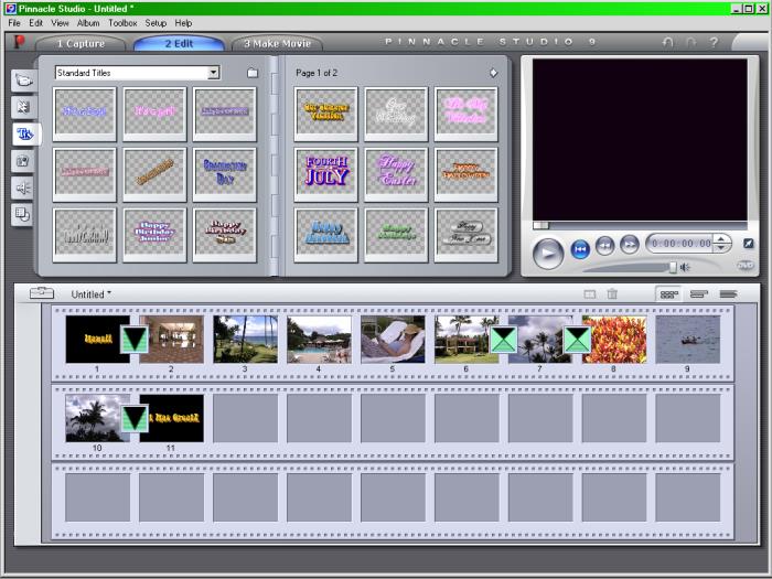
Pinnacle Studio comes with a remarkably advanced title designer considering the price. Studio’s Title Editor is based on Pinnacle’s Title Deko, a high-quality title designer used by many professional video editors. Studio also provides a selection of predesigned titles that are ready to drop right into any video project. To access these titles, click the Show Titles tab on the left side of the album. Click the arrow in the upper-right corner of the album to view additional pages. To see a preview of the title, click it once in the album. The title will appear in the viewer window. To add a title to your project, simply drag it from the album down to the timeline just as if it was a video clip. If the title is dropped on the video track, the title will be a fullscreen title which by default has a plain black background. If you use a predesigned title, chances are you’ll want to change some of the text. For example, even though I like the style of the “Snow Boarding” title, I don’t want the words Snow Boarding to appear because that’s not what is happening in the video. To edit the title, double-click it after you have added it to the timeline. The Studio Title Editor will open. You can also open the Title Editor and create a new title by double-clicking any blank space in the Title track of the timeline. The next section shows you how to edit a title.
Making effective titles
google blogger on
 When using titles in your movies, you should follow some basic guidelines to make them more effective. After all, funny or informative titles don’t do much good if your audience can’t read them. Follow these general rules when creating titles for your movies:
- Less is more. Try to keep your titles as brief and simple as possible.
- White on black looks best. When you read words on paper, black letters on white paper are easier to read. This rule does not carry over to video, however. In video images, light characters over a dark background are usually easier to read. An exception would be if you already have a relatively light background. But what if I want to put that same title near the top of the screen instead? The dark-colored title won’t work as well at the top of the screen because trees in the background will make it harder to read. As an alternative, I can create a small, dark background shape behind lighter colored text. (I’ll show you how to control title colors and styles in the next couple of sections.) Video displays such as TVs and computer monitors generate images using light. (You can think of a TV screen as a big light bulb.) Because TV displays emit light, full-screen titles almost never have black text on a white screen. Most people find staring at a mostly white TV screen about as unpleasant as staring at a lit light bulb: If you watch viewers look at a white TV screen, you may even see them squint. Squinting is bad, so stick to the convention of light words over a dark background whenever possible.
- Avoid very thin lines. In an interlaced display —such as a TV — every other horizontal resolution line of the video image is drawn in a separate pass or field. If the video image includes very thin lines — especially lines that are only one pixel thick — interlacing could cause the lines to flicker noticeably, giving your viewers a migraine headache in short order. To avoid this, choose fonts that have thicker lines. For smaller characters, avoid serif fonts such as Times New Roman. Serifs (the extra strokes at the ends of characters in some fonts, such as the one you’re reading right now) often have very thin lines that flicker on an interlaced video display.
- Think big. Remember that the resolution on your computer screen is a lot finer than what you get on a typical TV screen. Also, TV viewers typically watch video from longer distances than do computer users — say, across the room while plopped on the sofa, compared to sitting just a few inches away in an office chair. This means the words that look pleasant and readable on your computer monitor may be tiny and unintelligible if your movie is output to tape for TV viewing. Never be afraid to increase the size of your titles.
- Think safety. Most TVs suffer from a malady called overscan, which is what happens when some of the video image is cut off at the edges of the screen. You can think of TVs as being kind of like most computer printers. Most TVs can’t display the far edges of the video image, just as most printers can’t print all the way to the very edges of the paper. When you’re working on a word processing document, your page has margins to account for the shortcomings of printers as well as to make the page more readable. The same applies to video images, which have title safe margins. To ensure that your titles show up on-screen and are not cut off at the edges, make sure your titles remain within this margin (also sometimes called the title safe boundary). Apple iMovie doesn’t show these margins on-screen; instead, it automatically keeps your titles inside the margins. If you know your movie will be viewed only on computer screens, place a check mark next to the QT Margins option in the Titles window. This places the margins closer to the edge of the screen.
- The margins are displayed on-screen and you have to remember to keep your titles inside them. The margins appear in the Title Editor window as red dotted lines.
- Play, play, play. I cannot stress enough the importance of previewing your titles, especially overlays. Play your timeline after adding titles to see how they look. Make sure the title is readable, positioned well onscreen, and visible long enough to be read. If possible, preview the titles on an external video monitor.
Creating titles for your movies
google blogger on Tuesday, December 16, 2008

It’s easy to think of titles as just words on the screen. But think of the effects, both forceful and subtle, that well-designed titles can have. Consider the Star Wars movies, which all begin with a black screen and the phrase, “A long time ago, in a galaxy far, far away . . .” The simple title screen quickly and effectively sets the tone and tells the audience that the story is beginning. And then, of course, you get those scrolling words that float three-dimensionally off into space, immediately after that first title screen. A story floating through space is far more interesting than white text scrolling from the bottom to top of the screen, don’t you think?
Titles can generally be put into two basic categories: Full-screen and overlays. Full-screen titles are most often used at the beginning and end of a movie, where the title appears over a background image or a solid color (such as a plain black screen). The full-screen title functions as its own element in the movie, as does any video clip. An overlay title makes words appear right over a video image
Giving Credit with Titles
google blogger on

In their rush to get to the pictures, folks who are new to video editing often overlook the importance of titles. Titles — the words that appear on-screen during a movie — are critically important in many different kinds of projects. Titles tell your audience the name of your movie, who made it, who starred in it, who paid for it, and who baked cookies for the cast. Titles can also clue the audience in to vital details — where the story takes place, what time it is, even what year it is — with minimum fuss. And of course, titles can reveal what the characters are saying if they’re speaking a different language. Virtually all video-editing programs include tools to help you create titles.
Adjusting transitions in Studio
google blogger on

Adjusting transitions in Pinnacle Studio works a lot like adjusting regular video clips. To modify a transition, here’s the drill:
- Double-click the transition in the timeline. The Clip Properties window appears above the timeline.
- Adjust the Duration of the transition in the upper-right corner of the window by clicking the up or down arrows next to the Duration field at the top of the Clip Properties window.
- If you’re working with sample clips, change the duration to 15 frames.
Modifying iMovie transitions
google blogger on

The iMovie transition window doesn’t just provide a place to store transitions; it also allows you to control them. To adjust the length of a transition, follow these steps:
- Click the transition in the timeline to select it.
- Adjust the Speed slider in the transitions window. If you’re working with sample clips, adjust the transition between Scene 1 and Scene 2 down so it’s only 15 frames long. The length of the transition will be shown in the preview window.
- Click Update in the transitions window to update the length of the transition in the timeline.
- Click the Play button under the preview window to preview your results.
Adjusting transitions
google blogger on
 Video transitions usually have some features or attributes that can be adjusted. Most important, perhaps, is the length of the transition. The default length for most transitions is about two seconds. If you added a dissolve transition between the Scene 1 and Scene 2 sample clips (as described in the previous section), the two-second interval covers the time when wisps of Scene 2 just barely start to appear, ending when the last trace of Scene 1 fades out of existence.
Sometimes a two-second transition is too long — or not long enough. When applied to the sample clips Scene 1 and Scene 2, a two-second dissolve really is too long because it obscures a spectacular crash at the end of Scene 1. The next two sections show you how to adjust the length of transitions and make other changes where possible.


